We here at Slasher Studios get as excited for a new movie poster as we do for the film itself. A poster can have a huge impact on the film as audiences-to-be make first impression decisions when they see the artwork. Below is a list, in no particular order, of some of our favorites throughout the years.

Halloween
The way the hand and knife was incorporated into the pumpkin was pure genius. It’s simple, yet complex, as the two graphics flow together into one iconic image. Dozens of horror movies have tried to imitate this poster and all of them have failed to one degree or anything.
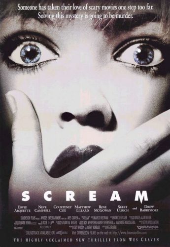
Scream
One of our all-time favorites right here. Another brilliant, clean and simple execution to this poster. Upcoming audiences are shown a close up of Drew Barrymore. This plays with their minds by planting a thought that she may one of the characters to last. The blue eyes stand out within the black and white photo and the fact she is taking more of a gasp than a scream, creates a nice contradiction.
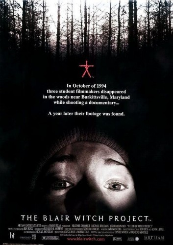
The Blair Witch Project
This is a very unique poster. It doesn’t have a whole lot going on, yet our eyes are pulled to all over the work. The black trees with the white sky draws us to the top. The red log brings us to the center and then of course, the well know close up, brings us to the lower half before we make our way down to the credits. This is one of those posters that is greatly recognizable and indeed had an impact on the film.
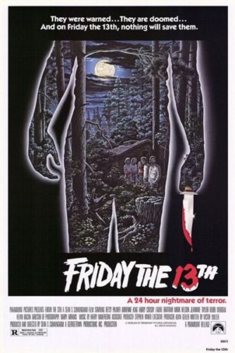
Friday The 13th
A true classic horror poster! This was the little movie-that-could and of course was in the need for a great poster. The silhouette of the killer was an amazing idea. It doesn’t give away who the killer is and it definitely helps in keeping the audience guessing throughout the film. The landscape artwork within the silhouette helps get two things done at once. We get the killer on the poster in great fashion as well as the the rest of the cast and the world they live in. Having the bloody knife drip over the blood cover 13 is a great aspect to this piece.
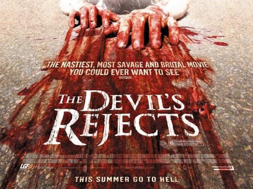
The Devil’s Rejects
The main difference about this one is the fact that we are given a horazontal poster to help please the eyes. There is a reason that films are in widescreen (we see more picture and it is closer to how humans see the world) and the poster below mimics the format. Beyond that, we again have a fairly simple set up. Blood covered hands being dragged on a road gives us a sense of what we are in for. Even the little detail to the skin on the fingers is A+++.
