Slasher Poster Friday: “Friday the 13th” Series

Last time on Horror Movie Poster Friday, I reviewed posters off the classic Evil Dead trilogy. This time, with the recent passing of the legendary Betsy Palmer, I’m showing off some beautiful art for my favorite slasher franchise of all time, Friday the 13th. Whether it’s fan art or official, I’m selecting my favorite poster from each entry in the original series (1-8).

View post on imgur.com


Art credit: unknown

View post on imgur.com


Art credit: Jeff Zornow

View post on imgur.com


Art credit: unknown

View post on imgur.com


Art credit: Jeff Zornow

View post on imgur.com


Art credit: unknown

View post on imgur.com


Art credit: Phantom City Creative

View post on imgur.com


Art credit: Chris Garofalo

View post on imgur.com


Art credit: unknown

Beautiful posters for a beautiful and iconic franchise. The Jason Takes Manhattan poster above is my favorite horror poster of all time. Simple, clean, and elegant. How I wish it were the official poster.
Check back next Friday for the next installment of Horror Movie Poster Friday.

–Noah Nicholas Nelson

Share:

Horror Poster Friday: “The Evil Dead” Trilogy

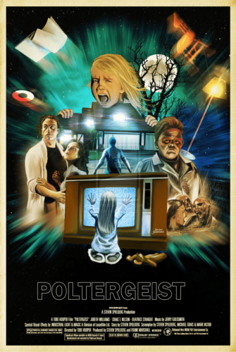
Last week I did a write-up on how much I love the fan art for the 1968 classic Night of the Living Dead, one of my all-time favorite horror films. This week, I’m taking a look at the immortal 1981 Sam Raimi classic The Evil Dead and its sequels. 1981 was a big year for horror, arguably one of the biggest. Lots of films were made that year but not many from that year can say they spawned two sequels, a remake, and an upcoming TV show. Shot on a budget of around $350,000, The Evil Dead is the kind of classic every indie filmmaker wishes to create.

Without further ado, our first poster.

ykeP5P6
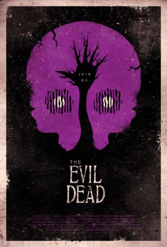
Art credit: Mark Welser

Stunning. Beautifully psychadelic and macabre and I love the stained texture and vibrancy. It’s simple, it’s creative, and it works.

aTFtYo5
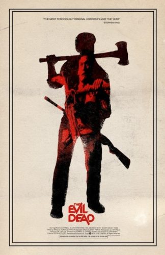
Art credit: Adam Juresko

I’m a sucker for posters like this. I love all the contrast and it’s very cleanly edited with the worn edges of Ash perfectly executed.

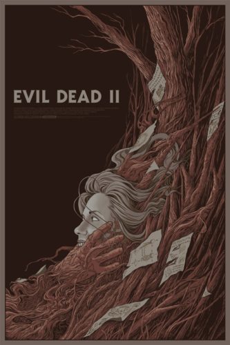
Now on to the first sequel, Evil Dead II.

VEJkE6j
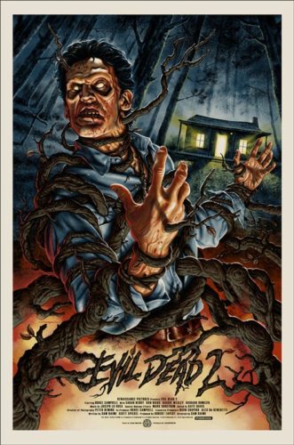
Art credit: Jason Edmiston
My personal favorite of this list. All of the colors are layered perfectly and there’s so much detail in the drawing. Hollywood horror really needs to take notes from this artist and hire him for some pieces.

F0DzVZT
Art credit: Randy Ortiz

Another clean, detailed drawing. Simple, elegant, and disturbing. The simple choice of font is breathtaking and the minimal use in color adds to the unique and unsettling feel.

Closing out this list, Army of Darkness.

AxGHjKl
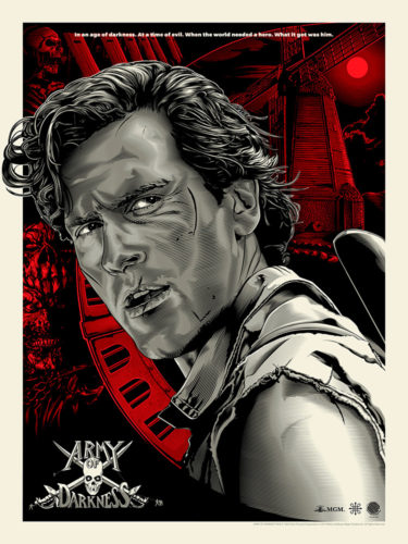
Art credit: Jeff Boyles

I can’t get over how many small details are put in this. The red background contrasts with the
black and white Ash beautifully and all of the little lines and the tiniest of details aren’t forgotten.

FY8Tnq3
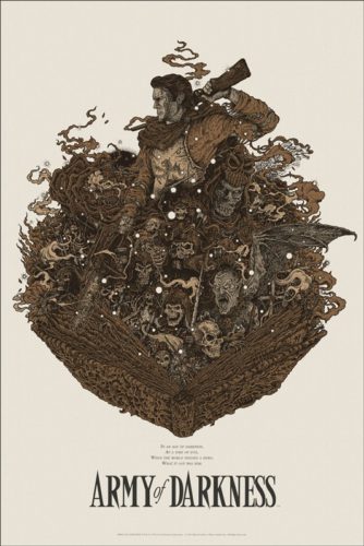
Art credit: Richey Beckett

Yet another highly detailed drawing. Another which keeps color to a minimum but still manages to grab your attention immediately. Absolutely gorgeous.

Three classic films, six gorgeous posters. Check back next Friday for the next Horror Poster Friday.

–Noah Nicholas Nelson

Share:

Horror Movie Poster Friday: “Night of the Living Dead” (1968)

Last week, I did a write-up on Tobe Hooper’s Poltergeist, which many people say scared them as a child. This week, I’m doing what I personally think is the scariest horror film. George Romero’s Night of the Living Dead. I remember seeing this movie around three years old and being scared of the opening music right away. To this day, I haven’t seen a movie that has sent as big of a chill down my spine even from the first act. A must-see for any horror fan.

I’m breaking down some beautiful posters of a beautiful film. Let’s start with the official poster.

2PXFHXG
I’ve always been in love with this poster. The green really constrasts with the black background and the (long) tagline is perfection. It’s the type of classic poster you would never see today.

Ll6S32t
Art credit: Grzegorz Domaradzki
my personal favorite on this list. Breathtaking. The simple use of color is stunning and the drawings are perfect. I’m normally not a fan of fonts like this but it goes well with the image. I want to buy this and hang it on my wall immediately.

EdO8tNh
Art credit: Timothy Pittides
I had never seen this poster before until I was gathering these images and I had to include it. It captures the feel of the film extremely well and the black and white immediately catches the eye. The moon skull is beautiful and I love the hands and drawing of Ben at the door.

IzCg451
While I couldn’t find the artist who designed this poster, I have to say that it is absolutely gorgeous. So much attention to detail and I love that they kept the original font. If you know who designed this poster, leave a comment and let me know and I’ll credit them.

vhHB6FV
Art credit: Killian Eng
Simple, to the point, and extremely scary. Another one that kept the original font which is a brilliant choice. The claustrophobic feel of this movie is captured perfectly in this piece: they’re always coming.

bdAYPvZ
This list wouldn’t be complete without this glorious foreign poster. While I’m not sure who designed this one either, I couldn’t leave it out. I’m a sucker for hand-painted posters.

Those are just a few of the many beautiful posters this film has. Truly a classic that will continue to make history. Check back next week where I’ll review even more stunning artwork.

–Noah Nicholas Nelson

Share:

Horror Movie Poster Friday: “Poltergeist” (1982)

Tobe Hooper’s Poltergeist is the rare horror film that gets everything right. The chilling moments are extremely terrifying, the heartfelt moments are truly touching, and the acting is as close to perfect as you can get. The late Heather O’Rourke gives a beautiful performance as the youngest Freeling child, Carol Anne and JoBeth Williams knocks it out of the park as the mother, Diane. The family bond feels genuine and holds this film together.

ui88gvW

For such a great film, I’ve always felt a little underwhelmed by the official poster. That may be an unpopular opinion and while I feel it’s ominous, creepy, and describes the film well, I think there’s a lot more creativity that could’ve been put into it.

With a remake just released, I thought it was fitting to revisit the original classic and break down three of the countless beautiful fan posters that have came along over the years.

uX0oLDB
Art credit: Jairo Guerrero

I can’t say enough about this poster. So much attention to detail and the drawing of Tangina is perfect. I’d love to see this art on a VHS release. This is exactly the type of poster I’d proudly display on my wall.

lKLejfB
Art credit: Ken Taylor

This poster made my jaw drop the first time I saw it. The perfect way to be ominous and subtle while still capturing the creepy quality the film has. A beautiful, haunting foreshadowing of the events of the movie.

6UEPRbM
Art credit: We Buy Your Kids

Ah, Tangina. One of my favorite characters in cinema. While I’m not the biggest fan of minimalist posters, this is one that I feel completely nails it. It feels very psychadelic and eye-catching. The choice of font is stunning and the orbs of light around her and closet doors reflected in her glasses are a very clever way to hint to the events of the film without giving away important scares if you haven’t seen it.

Those are just three of the many gorgeous fan posters this film has and I think it’s great that so many artists show their love for this horror gem. Check back next Friday for the next Horror Poster Friday.

–Noah Nicholas Nelson

Share:

Horror Movie Posters: “The Haunting” (1960) & (1999)

Fourteen years ago today, “The Haunting” remake opening in theaters everywhere and was a huge box office hit making nearly $200 million worldwide. It stands to date as one of the highest grossing horror remakes of all time although many critics were less than impressed. Today we are looking at the posters from the original classic “The Haunting” and comparing them with the posters from the remake. Which poster do you like the best and do you feel that the remake deserves more respect than it originally received upon release?

1

2

3

4

Original Cinema Quad Poster - Movie Film Posters

6

7

Share:

Horror Movie Posters: “The Granny” (1995)

get-attachment

The artwork for the 1995 film, The Granny, splashes with the bright color of yellow. Oddly enough, this is not a very brightly shot film, as it takes place in a dimly lit and somewhat dreary mansion. The visuals are pretty good though and really help this stand out in a see of other movies. The insane looking Stella Stevens catches the eye right away. She gives off the evil vibe instantly and then the eyes trickle down to the beautiful Shannon Whirry, with her clothes torn and plenty of skin showing. Overall, a very interesting piece of art, much like the film itself.

Share:

Horror Movie Posters: “Girlfriend from Hell” (1989)

Girlfriend From Hell is a horror comedy filled with some great cheesy one-liners. It’s fun to watch from beginning to end and this first poster helps sell the goods! It’s bright, full of color and we are treated to some cool custom text for the title graphic. This poster gives you a decent preview of what is to come once you pop in your vintage VHS.

posters_of_the_week_gfh_a

This second, revamped poster is…a disaster. Just an awful piece of crap that gives no insight into the film at all. A rose on fire? Thats the best they could come up with? Yikes!

posters_of_the_week_gfh_b

Share: